Simplifying the consumer edtech app user experience for 80k users
Simplifying the consumer edtech app user experience for 80k users
B2C | Industry project-LIVE
B2C | Industry project-LIVE
To enable parents to add funds to their child’s student app wallet quickly and easily, ensuring that their child always has sufficient balance to make purchases.
To enable parents to add funds to their child’s student app wallet quickly and easily, ensuring that their child always has sufficient balance to make purchases.
Note: Owing to NDA constraints, certain screens and user journey aspects may be absent in this case study. I'd be pleased to discuss it further, separately. 🙂
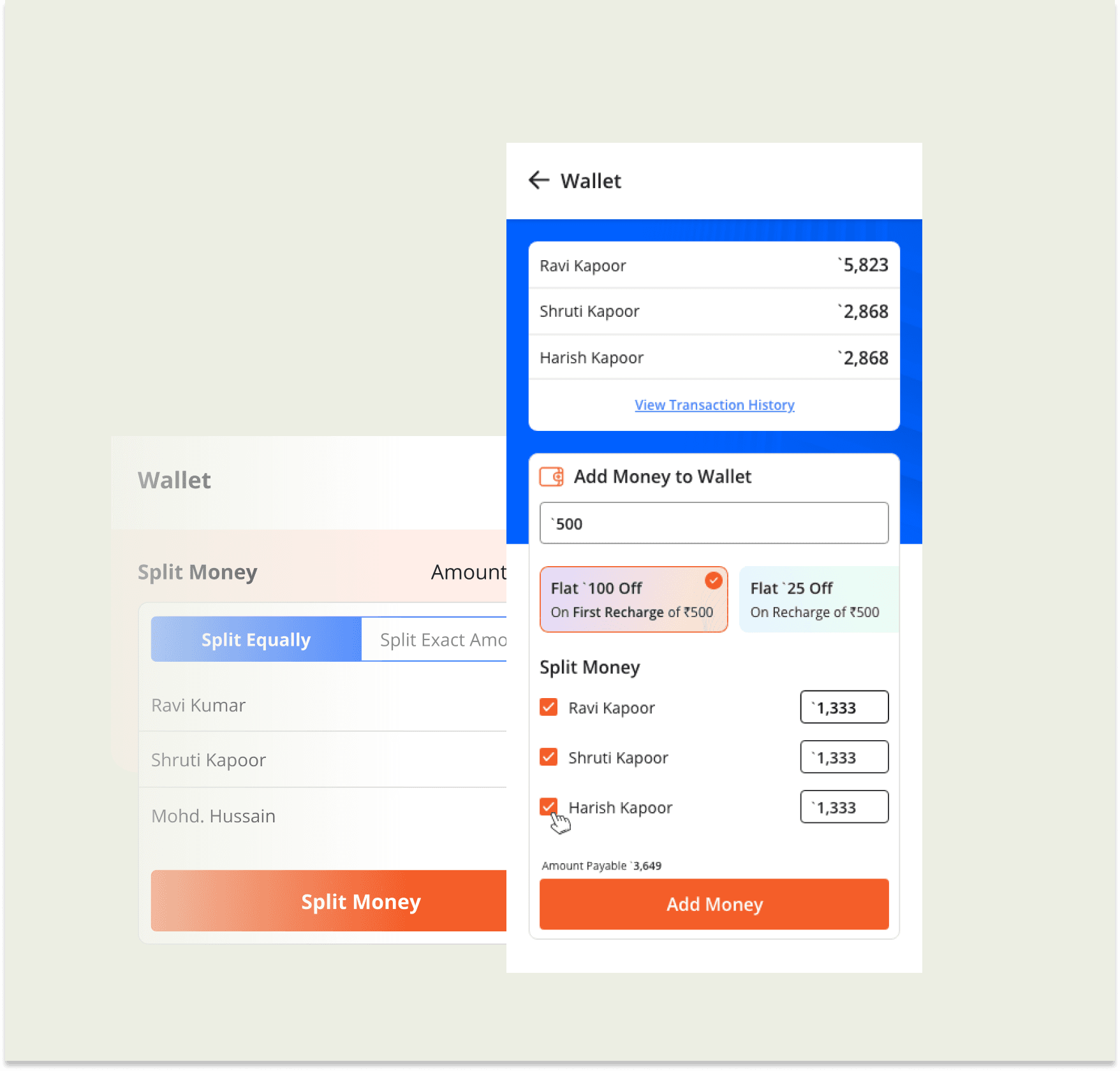

Mobile version under development. Please view on desktop only.
Mobile version under development. Please view on desktop only.
Participants
Product Manager, Experience Designer (me), UI Designer
Design brief
To enable parents to add funds to their child’s student app wallet quickly and easily, ensuring that their child always has sufficient balance to make purchases.
This objective focuses on the key benefits of the feature for parents and their children, emphasising the convenience and reliability of the wallet system. It also highlights the importance of quick and seamless transactions, which crucial for ensuring a positive user experience and encouraging continued usage of the app.
User will also be given a few coupons and its discounts on adding the money.
Iteration 1
Understanding the requirment:
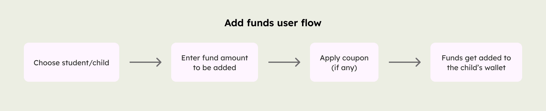
The student wants to take the course on the go, so he asks his parent or guardian to recharge his wallet. For this parent has to add these required funds in his child's wallet.
I had some follow-up questions after our initial conversation, so I reached out to the product manager.
This feature will be used by both students and parents app.
YesIs there a limit to the number of children that can be linked to a parent's account?
A parent can have up to 3 children linked to their account.
Scoping out:
The key screens involved in this user journey are as follows:
Wallet screen: This contains the summary of available balance in each student's account, Option to Add fund, Previous transactions.
Previous transaction screen: Summary of the details of transaction made, Transaction types- Successful, Awaited response or Failed.
Design:
It is a good rule of thumb to design for worst-case scenarios.
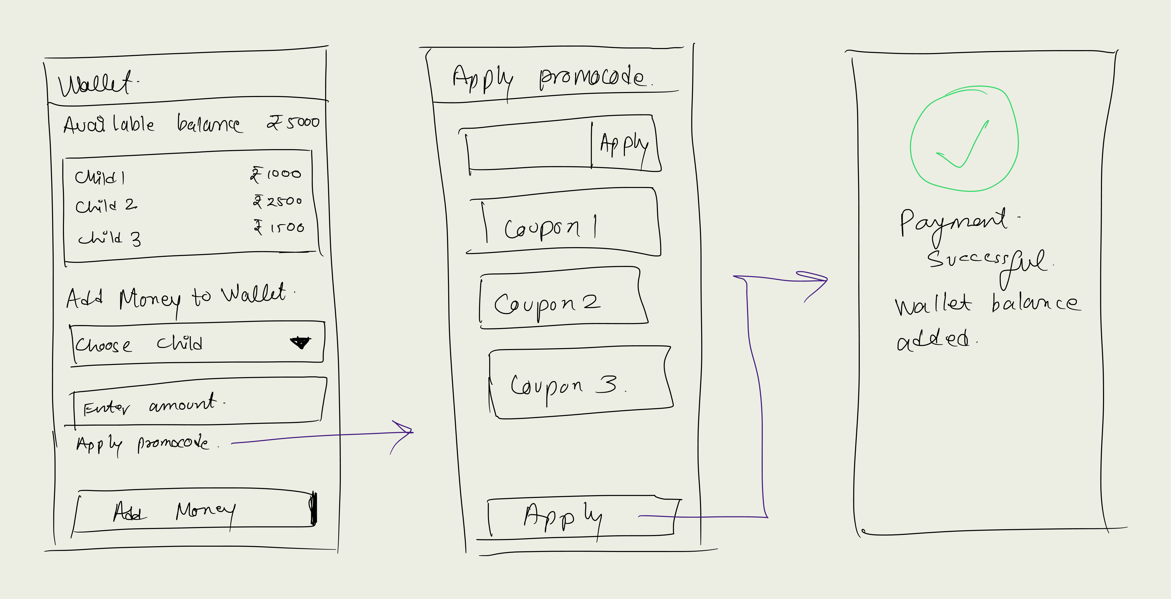
Design critique:
What if a parent wants to add funds for all three of their children? Is the dropdown multi-select? If so, how is the split happening?
We need to show coupons upfront.
The "Available balance" looks like it is the parent's wallet balance.
Follow-up questions:
Are funds added to the student's wallet directly from the parent's wallet, or are funds first added to the parent's wallet and then transferred to the student's wallet?
Iteration 2
Goals:
1. Parents can add money for all their children at once.
2. Apply coupon flow.
Ideating:
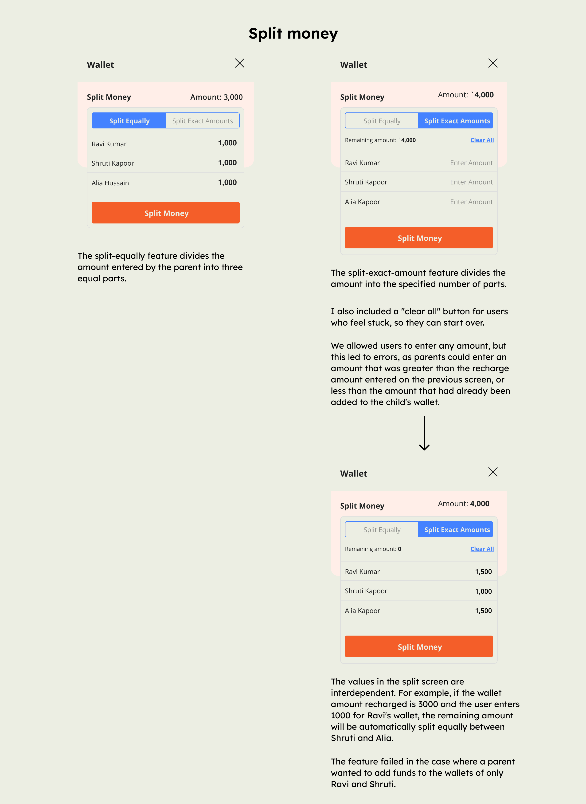
The parent can now add funds for all of their children at once, but we will need to provide a split feature in case the parent only wants to add funds for a few children. For example, the parent may only want to add funds for one/two of their children at a time.
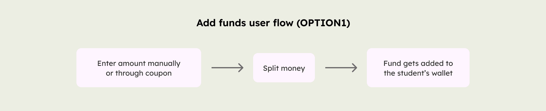
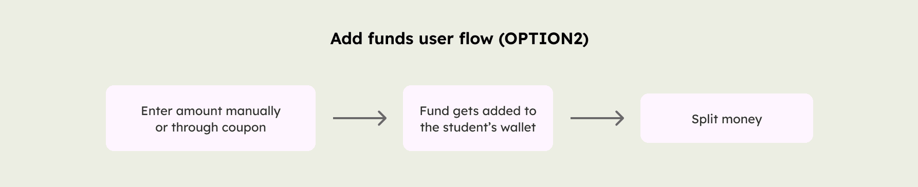
Option 1 is preferable here. But why?
Since there is no such thing as a parent wallet, where does the fund go if the transaction is complete?
The drop-off rate was higher in this case. User wants task to be done as quickly as possible.
Next steps:
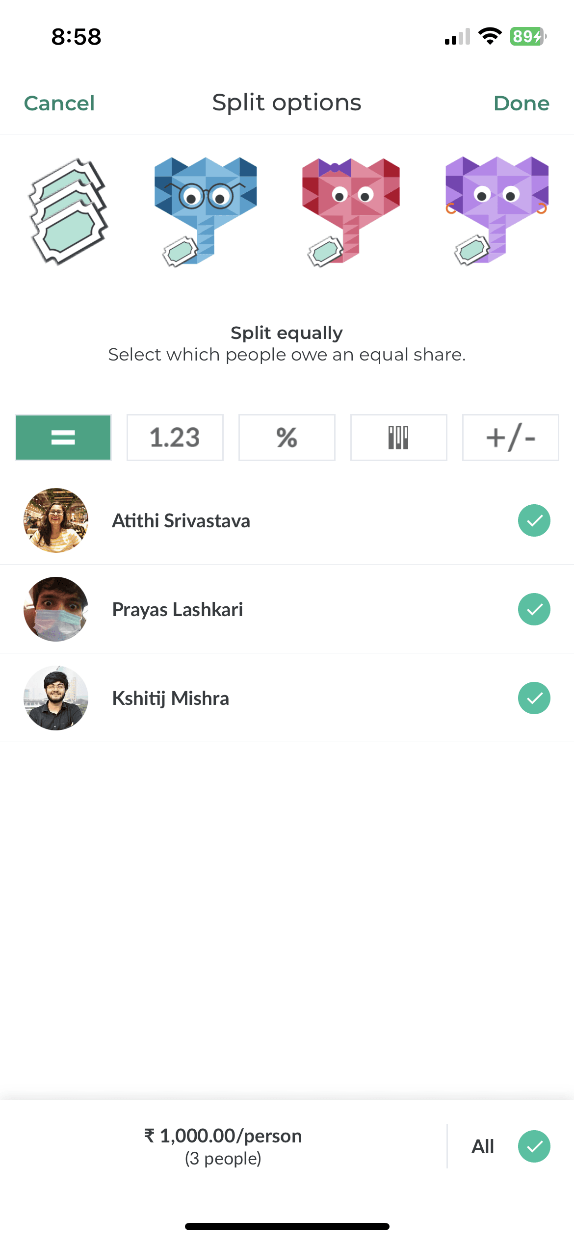
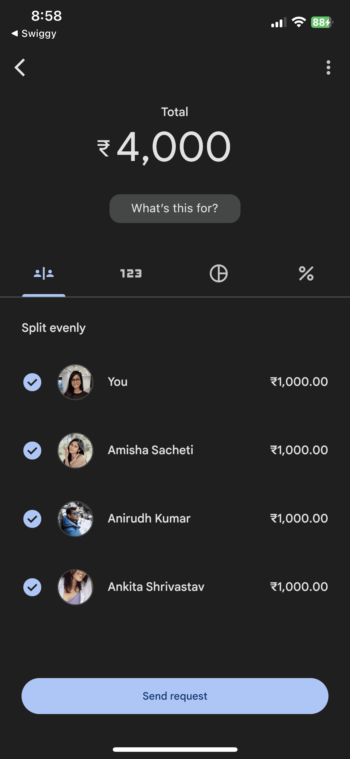
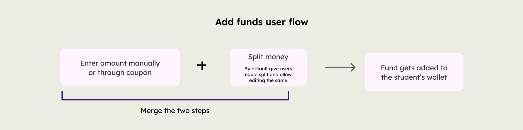
The challenge was to design a single screen for the "Split money" feature, as the previous implementation required users to navigate through three different screens. I found inspiration in a couple of different designs of splitting money. These were from GooglePay, Paytm and Splitwise

Iteration 3: But can we "turbocharge" the adding funds process?
Goals:
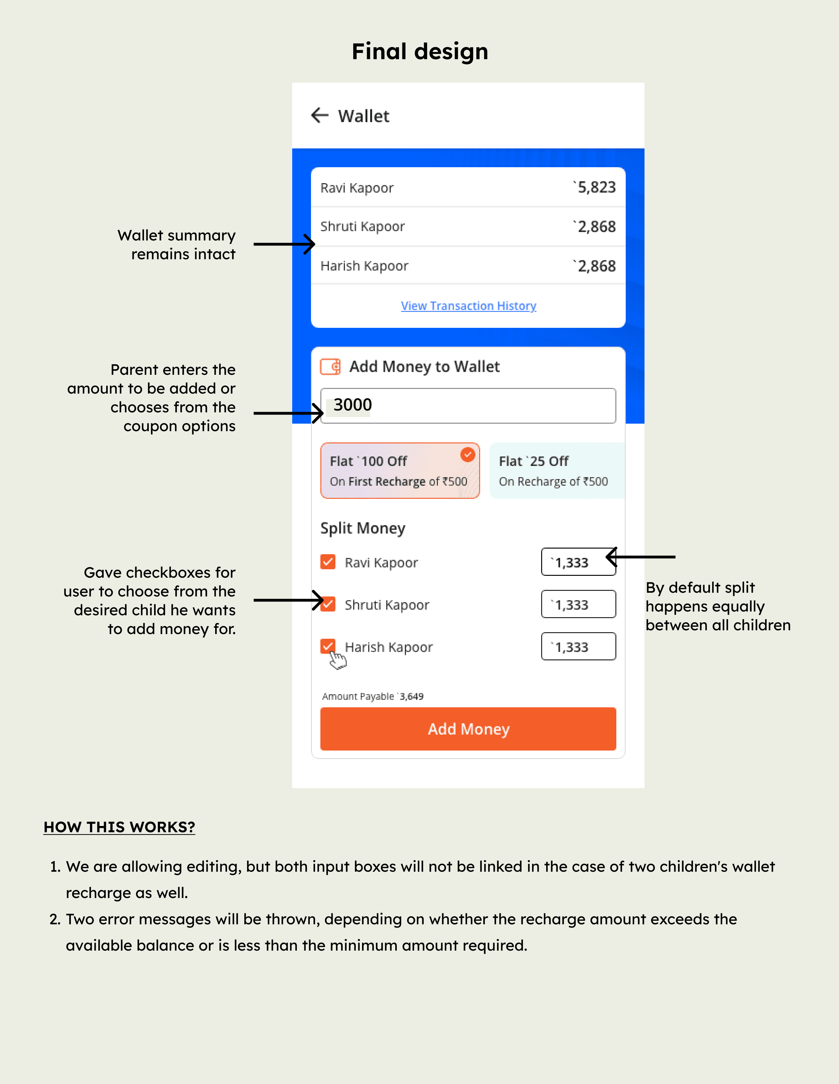
How to allow the parent to select the children for whom they want to recharge funds, even if there are more than two children.
Outcome:
Within a week of the release, we received an additional “x” (Can discuss exact number separately) amount in the wallet.
Upon reflection, I observed that the user flow got biased in this case. We could have developed a more equitable solution.
More projects
Designing a service booking shop for landscaping business with an 87.9% NPS
Read case study
Designing a ticket scheduling experience for a B2B SaaS product product
Read case study

STEM Design System: Saving around 600+ design and development hours
Read case study